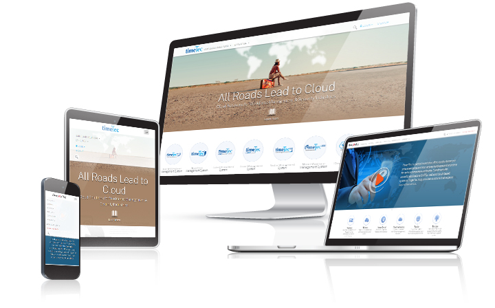
| All FingerTec and TimeTec’s websites and sub pages are built basing on a responsive web design platform. We strive to offer our virtual visitors the best time saving user experience regardless what device they are browsing from. This is to offer a pleasant, better, faster and smarter overall experience for the reader’s time that we are privileged to have. Having said that, we are not pausing there, as we value you our reader’s time very much. We have dedicated programmers and an R&D team who are constantly looking for ways to make your browsing experience a delightful one with us.
With that we would love to take suggestions, ideas or even evaluations from you to make better and enhance user’s browsing experience. Do drop us your thought at info@fingertec.com or simply visit www.fingertec.com to discover more about our latest development or click www.timeteccloud.com to understand and learn through a series of comprehensive cloud solutions. |