| |
Explore TimeTec’s Website Facelift with
New Responsive Design |
| |
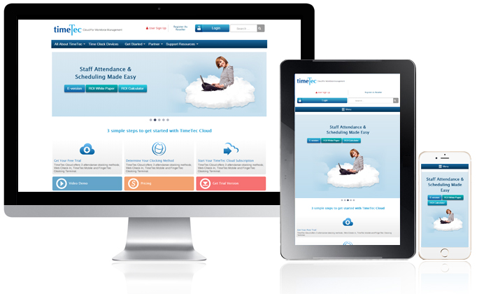
| This time around it’s not just another facelift, we have designed www.timeteccloud.com with the new responsive design, which lets you load to TimeTec other user interfaces, be it your smartphone, tablet or desktop, and experience the same interface! The new responsive front-end adapts to different screen sizes by presenting content through adaptive layouts, allowing convenient viewing that is supported on all kinds of devices from 21” desktop monitors to 7” tablets and 4” smart phones. |
| |
 |
| |
| 4 advantages of a responsive web design |
| |
| • |
Perfect readability regardless of what device you use to display the website |
|
• |
Well-structured appearance in a hierarchal top-down formation |
| • |
Easily convey messages and information to website users |
• |
Smart content prioritization helps users find what they need more efficiently |
|
| |
| |
|
| |
| So what do you think? |
| Give us some feedback on how we can further improve or if you’re experiencing any problems using our new website, please contact us at info@fingertec.com. |
| |
|
| |
|
|
|
| |